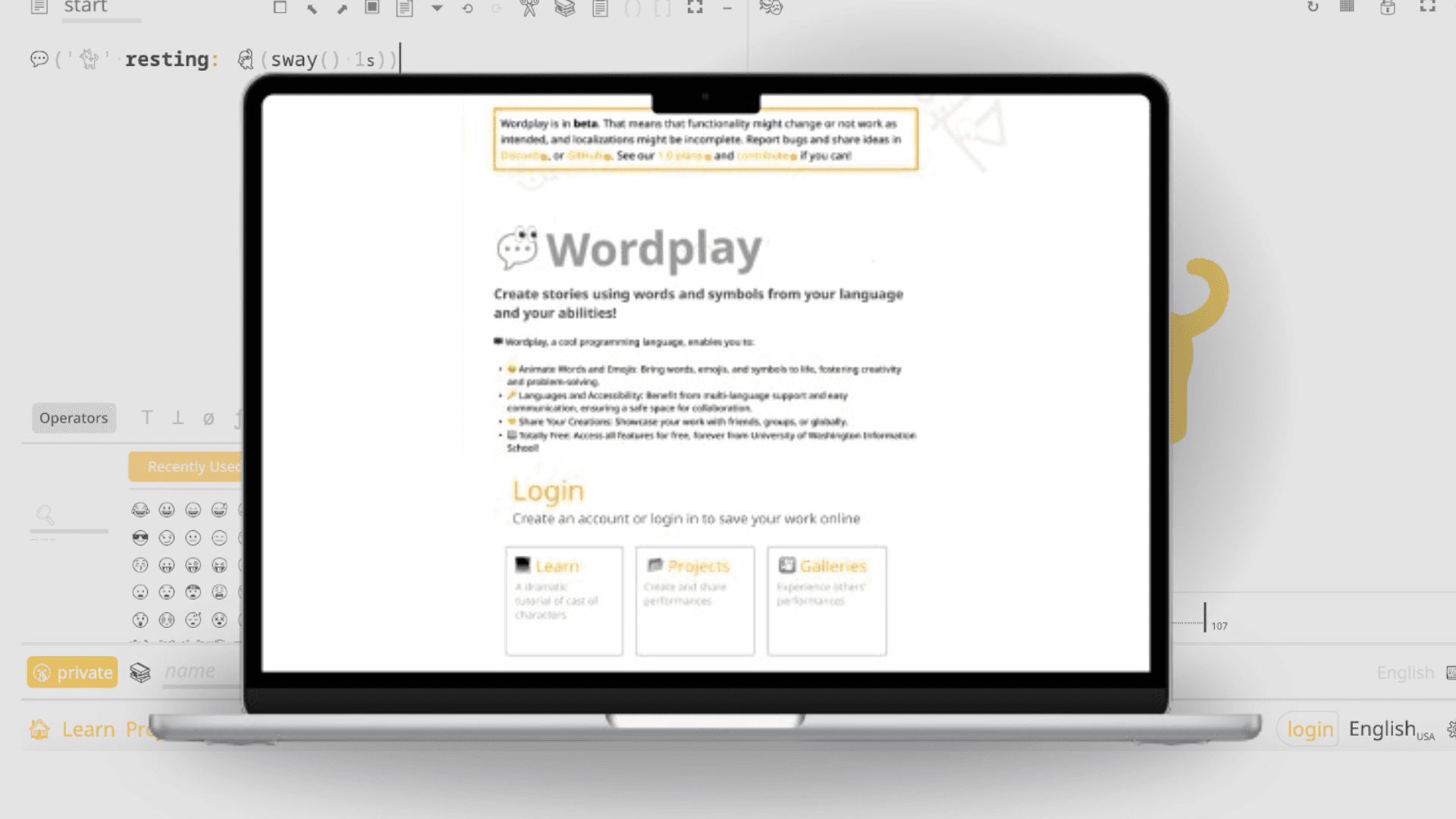
Wordplay
PROJECT TYPE
B2B Web App
DURATION
13 Months
ROLE
Product Designer
TEAM
1 Project Manager
2 Product Designer
1 Software Engineer
A justice-centered programming language education platform
PROJECT TYPE
B2B Web App
DURATION
13 Months
ROLE
Product Designer
TEAM
1 Project Manager
2 Product Designers
1 Software Engineer
Code is a universal language—but learning it isn’t equally accessible.
Wordplay is an experimental programming language developed at the University of Washington to make coding more inclusive for non-native English speakers and learners with disabilities.
As the UX Designer on the Wordplay project at the University of Washington, led by Professor Amy J. Ko, I designed the user experience and interface for an experimental programming language and IDE, making the learning experience more intuitive, inclusive, and approachable.
Code is a universal language—but learning it isn’t equally accessible.
Wordplay is an experimental programming language developed at the University of Washington to make coding more inclusive for non-native English speakers and learners with disabilities.
As the UX Designer on the Wordplay project at the University of Washington, led by Professor Amy J. Ko, I designed the user experience and interface for an experimental programming language and IDE, making the learning experience more intuitive, inclusive, and approachable.

Empathize & Define: Who are we designed for?
Empathize & Define:
Who are we designed for?
Rather than designing from assumptions, we created personas to keep user needs at the center of every decision. Since we couldn’t interview elementary students directly, we gathered insights from instructor surveys and translated them into personas that guided our design process.
Rather than designing from assumptions, we created personas to keep user needs at the center of every decision. Since we couldn’t interview elementary students directly, we gathered insights from instructor surveys and translated them into personas that guided our design process.


Our research made one thing clear: the biggest barrier wasn’t writing code—it was navigating the experience around it.
Every confusing screen and unfamiliar concept added unnecessary cognitive load before learning could even begin. To maximize my impact, I focused on two key touchpoints: helping users get started with confidence through a redesigned homepage, and reducing friction in the Unicode experience.
Our research made one thing clear: the biggest barrier wasn’t writing code—it was navigating the experience around it.
Every confusing screen and unfamiliar concept added unnecessary cognitive load before learning could even begin. To maximize my impact, I focused on two key touchpoints: helping users get started with confidence through a redesigned homepage, and reducing friction in the Unicode experience.
Opportunity #1
Helping Users Get Started - Homepage redesign
Opportunity #1
Helping Users Get Started - Homepage redesign
Previous Homepage Design vs. New Homepage Design
Previous Homepage Design
vs.
New Homepage Design

Previous Experience
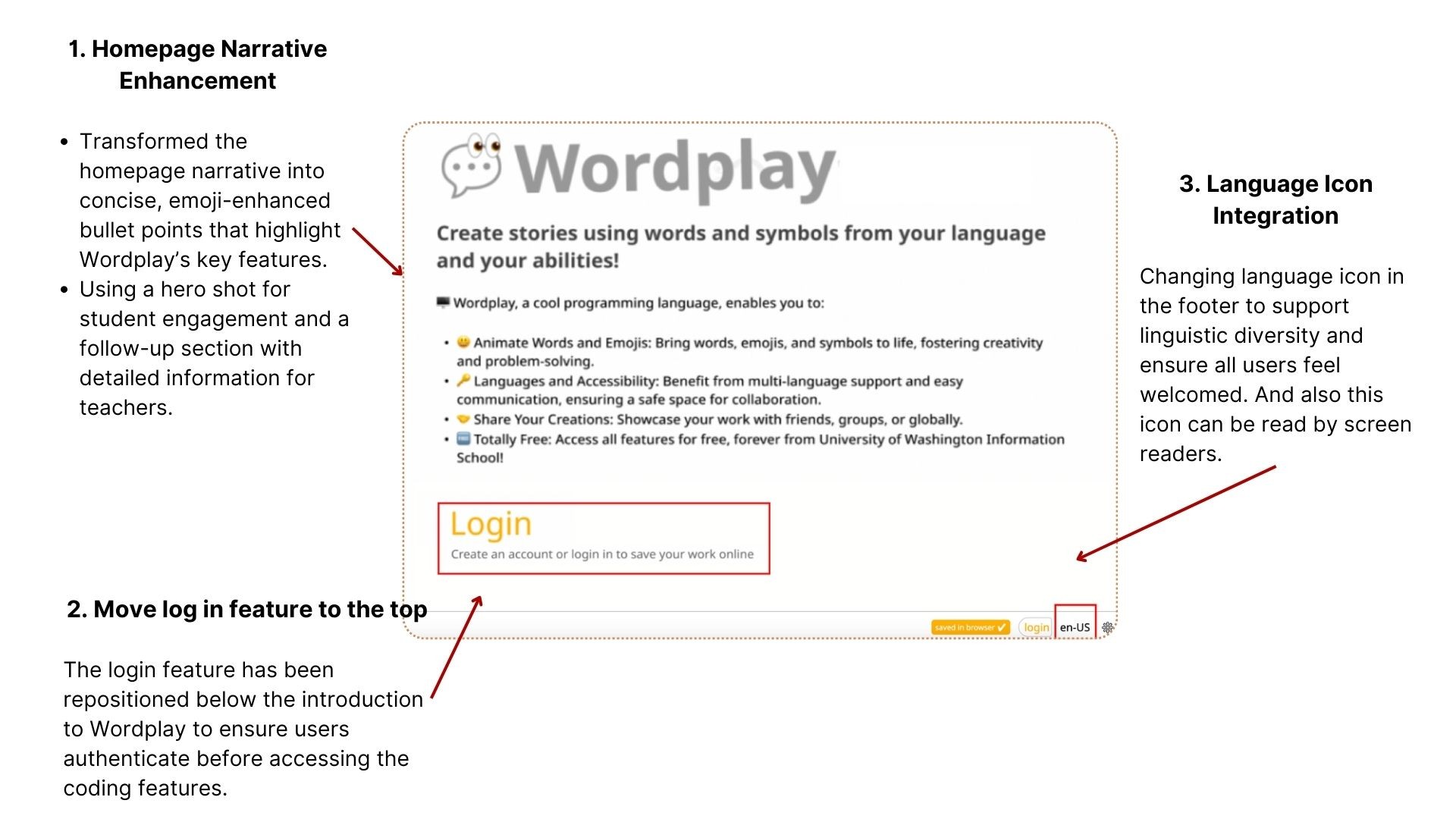
Dense, text-heavy layout increased cognitive load.
Weak visual hierarchy made key actions difficult to discover.
Clickable areas lacked clear affordances.
Previous Experience
Dense, text-heavy layout increased cognitive load.
Weak visual hierarchy made key actions difficult to discover.
Clickable areas lacked clear affordances.
New Experience
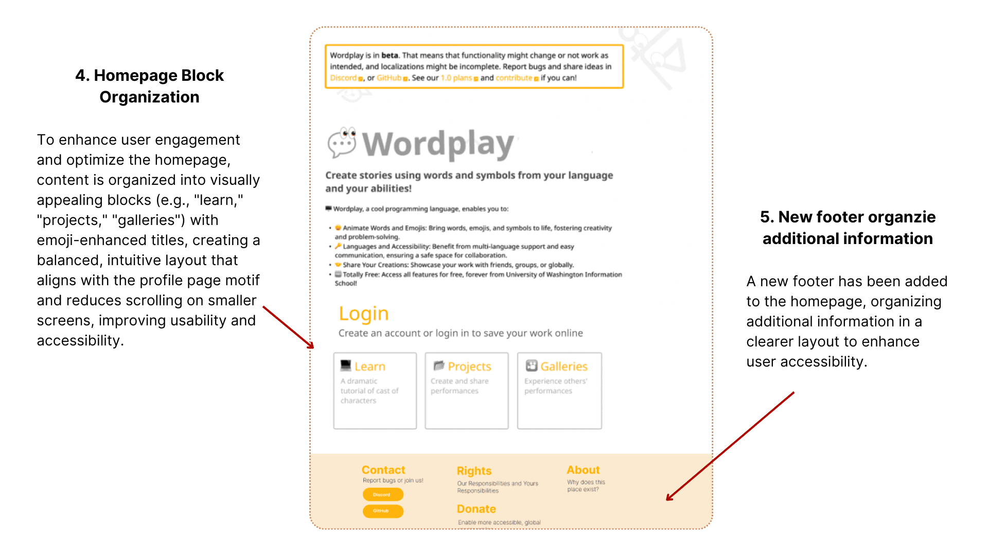
Simplified content into concise, scannable sections.
Introduced a card-based layout with stronger visual hierarchy.
Prioritized primary actions while moving secondary content to the footer.
Created a clearer, more approachable starting point for first-time users.
New Experience
Simplified content into concise, scannable sections.
Introduced a card-based layout with stronger visual hierarchy.
Prioritized primary actions while moving secondary content to the footer.
Created a clearer, more approachable starting point for first-time users.
Design Process
Cognitive Load
“The sentences are too long.”
“I only read the large text.”
“I don’t want to scroll.”
Search results surfaced irrelevant Unicode characters, and some valid characters failed to display because of implementation bugs.
Simplify content into concise, scannable sections with a clear visual hierarchy
Allowing users to focus on learning instead of processing the interface
Accessibility & Discoverability
“Make Help and Language more visible.”
“It looks like a chat button.”
“The navigation bar being on top would be better.”
Improve the visibility and affordance of key actions using familiar icons, clearer navigation, and more intuitive placement.
Emotional Engagement
“I prefer the mascot.”
“It would be better if the words were icons.”
“The floating letters are hard to see.”
“More Colorful!”
Strengthen the product’s playful identity through memorable visuals, recognizable icons, and a more engaging interface that feels welcoming to young learners.
Analyze user research results and prioritize solutions
Rather than jumping into redesigning the homepage, I first synthesized user feedback to understand which issues created the most friction. By grouping recurring pain points into four themes, I was able to identify the highest-impact opportunities before exploring solutions.
Analyze user research results and prioritize solutions
Rather than jumping into redesigning the homepage, I first synthesized user feedback to understand which issues created the most friction. By grouping recurring pain points into four themes, I was able to identify the highest-impact opportunities before exploring solutions.
Analysis user research result and prioritize solutions
Rather than jumping into redesigning the homepage, I first synthesized user feedback to understand which issues created the most friction. By grouping recurring pain points into four themes, I was able to identify the highest-impact opportunities before exploring solutions.
Insight
What Users Told Us
Design Opportunity
Cognitive Load
“The sentences are too long.”
“I only read the large text.”
“I don’t want to scroll.”
Simplify content into concise, scannable sections with a clear visual hierarchy
Allowing users to focus on learning instead of processing the interface
Accessibility & Discoverability
“Make Help and Language more visible.”
“It looks like a chat button.”
“The navigation bar being on top would be better.”
Improve the visibility and affordance of key actions using familiar icons, clearer navigation, and more intuitive placement.
Emotional Engagement
“I prefer the mascot.”
“It would be better if the words were icons.”
“The floating letters are hard to see.”
“More Colorful!”
Strengthen the product’s playful identity through memorable visuals, recognizable icons, and a more engaging interface that feels welcoming to young learners.
Cognitive Load
🚀🚀🚀
Prioritized
⭐⭐⭐
Improves first impressions and helps every beginner get started with confidence.
Accessibility & Discoverability
🚀🚀🚀
Prioritized
⭐⭐⭐
Makes essential features easier to find and reduces navigation friction.
Emotional Engagement
🚀
Planned for later iteration
⭐⭐
Reinforces Wordplay’s playful identity and encourages exploration.
Not every suggestion became a feature.
I evaluated each opportunity based on user impact, accessibility, and implementation effort, then collaborated with my professor and developers to prioritize the changes that would create the greatest improvement for first-time users while fitting within our project timeline.
Not every suggestion became a feature.
I evaluated each opportunity based on user impact, accessibility, and implementation effort, then collaborated with my professor and developers to prioritize the changes that would create the greatest improvement for first-time users while fitting within our project timeline.
Opportunity
Priority
User Impact
Cognitive Load
🚀🚀🚀
Prioritized
⭐⭐⭐
Improves first impressions and helps every beginner get started with confidence.
⭐⭐⭐
Improves first impressions and helps every beginner get started with confidence.
Accessibility & Discoverability
🚀🚀🚀
Prioritized
⭐⭐⭐
Makes essential features easier to find and reduces navigation friction.
Emotional Engagement
🚀
Planned for later iteration
⭐⭐
Reinforces Wordplay’s playful identity and encourages exploration.
After presenting my prioritization, I aligned with my professor on the proposed design direction. With agreement on the highest-impact opportunities, I moved from research into designing the first iteration of the interface.
With the design direction aligned, I translated these insights into an initial interface, using it as a foundation to explore layout, hierarchy, and navigation before refining the final experience.
First Prototype - Turning Insights into Interface
With the design direction aligned, I translated these insights into an initial interface, using it as a foundation to explore layout, hierarchy, and navigation before refining the final experience.
Final Design - Helping Users Get Started with Confidence
Final Design
Helping Users Get Started with Confidence
After presenting my prioritization, I aligned with my professor on the proposed design direction. With agreement on the highest-impact opportunities, I moved from research into designing the first iteration of the interface.
After presenting my prioritization, I aligned with my professor on the proposed design direction. With agreement on the highest-impact opportunities, I moved from research into designing the first iteration of the interface.

Opportunity #2
Removing Friction from Learning - Unicode redesign
Previous glyph chooser vs. New glyph chooser
Previous glyph chooser
vs.
New glyph chooser
Previous Experience
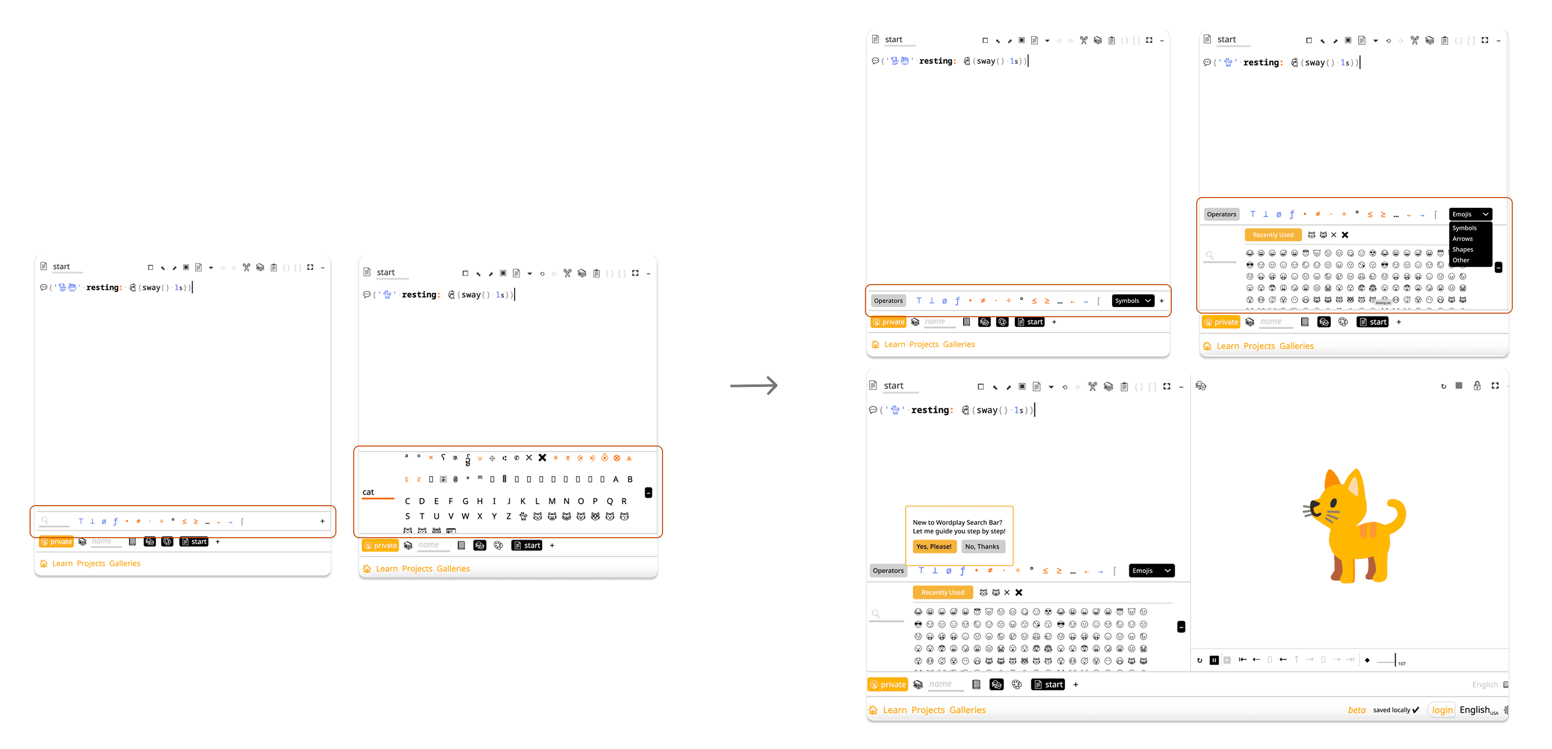
Disorganized glyphs increased cognitive load.
Inaccurate search results made finding symbols difficult.
Missing Unicode characters broke users’ workflow and reduced trust.
Previous Experience
Disorganized glyphs increased cognitive load.
Inaccurate search results made finding symbols difficult.
Missing Unicode characters broke users’ workflow and reduced trust.
New Experience
Organized symbols into intuitive categories for faster discovery.
Surfaced commonly used operators to reduce search effort.
Added an onboarding tutorial to help first-time users learn Unicode with confidence.
New Experience
Organized symbols into intuitive categories for faster discovery.
Surfaced commonly used operators to reduce search effort.
Added an onboarding tutorial to help first-time users learn Unicode with confidence.
Design Process


Understanding Before Designing
I quickly realized that redesigning the Unicode experience wasn’t just a UI challenge—it required understanding the system behind it. Before sketching any solutions, I researched how Unicode works and examined Wordplay’s implementation to understand both user pain points and technical constraints. This foundation allowed me to design with confidence, balancing usability with feasibility.
Understanding Before Designing
I quickly realized that redesigning the Unicode experience wasn’t just a UI challenge—it required understanding the system behind it. Before sketching any solutions, I researched how Unicode works and examined Wordplay’s implementation to understand both user pain points and technical constraints. This foundation allowed me to design with confidence, balancing usability with feasibility.
From Bugs to Insights
From Bugs to Insights
Reliability Issues
Search results surfaced irrelevant Unicode characters, and some valid characters failed to display because of implementation bugs.
Lack of Prioritization
Frequently used programming operators were buried among hundreds of symbols, making common tasks unnecessarily difficult.
Limited Accessibility
Although Wordplay supports multiple languages, the Unicode browser wasn’t designed with multilingual users in mind.
Before redesigning the Unicode experience, I organized a bug bash with the team to uncover the biggest pain points in the existing workflow.
Rather than fixing individual issues one by one, I synthesized the findings into three recurring themes that became the foundation for the redesign.
Before redesigning the Unicode experience, I organized a bug bash with the team to uncover the biggest pain points in the existing workflow.
Rather than fixing individual issues one by one, I synthesized the findings into three recurring themes that became the foundation for the redesign.
Insight
What We Found
Reliability Issues
Search results surfaced irrelevant Unicode characters, and some valid characters failed to display because of implementation bugs.
Lack of Prioritization
Frequently used programming operators were buried among hundreds of symbols, making common tasks unnecessarily difficult.
Limited Accessibility
Although Wordplay supports multiple languages, the Unicode browser wasn’t designed with multilingual users in mind.
I viewed them as symptoms of a larger UX problem: beginners were spending too much effort finding symbols instead of learning to code. These insights shaped my redesign of the Unicode experience, focusing on discoverability, reliability, and accessibility.
I viewed them as symptoms of a larger UX problem: beginners were spending too much effort finding symbols instead of learning to code. These insights shaped my redesign of the Unicode experience, focusing on discoverability, reliability, and accessibility.
Prototype: Proposed solution
UI redesign - Simplifying the Unicode Experience
UI redesign - Simplifying the Unicode Experience
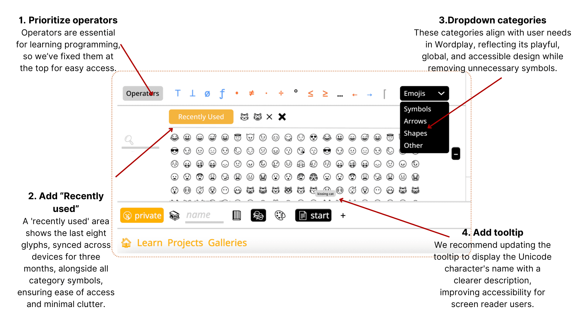
Breaking the Language Barrier
While Wordplay supports multiple languages, Unicode search only recognized English keywords, preventing users from finding symbols in their native language. To address this, I proposed a phased localization strategy—starting with the most commonly used Unicode categories—to make the experience more accessible while keeping implementation scalable.
Breaking the Language Barrier
While Wordplay supports multiple languages, Unicode search only recognized English keywords, preventing users from finding symbols in their native language. To address this, I proposed a phased localization strategy—starting with the most commonly used Unicode categories—to make the experience more accessible while keeping implementation scalable.
3. Future Opportunities
Guided Onboarding
For many beginners, Unicode is an unfamiliar concept. Introducing contextual tutorials and onboarding tips would help users learn key features progressively, reducing cognitive load and building confidence as they explore the platform.
3. Future Opportunities
Guided Onboarding
For many beginners, Unicode is an unfamiliar concept. Introducing contextual tutorials and onboarding tips would help users learn key features progressively, reducing cognitive load and building confidence as they explore the platform.
3. Future Opportunities
Guided Onboarding
For many beginners, Unicode is an unfamiliar concept. Introducing contextual tutorials and onboarding tips would help users learn key features progressively, reducing cognitive load and building confidence as they explore the platform.
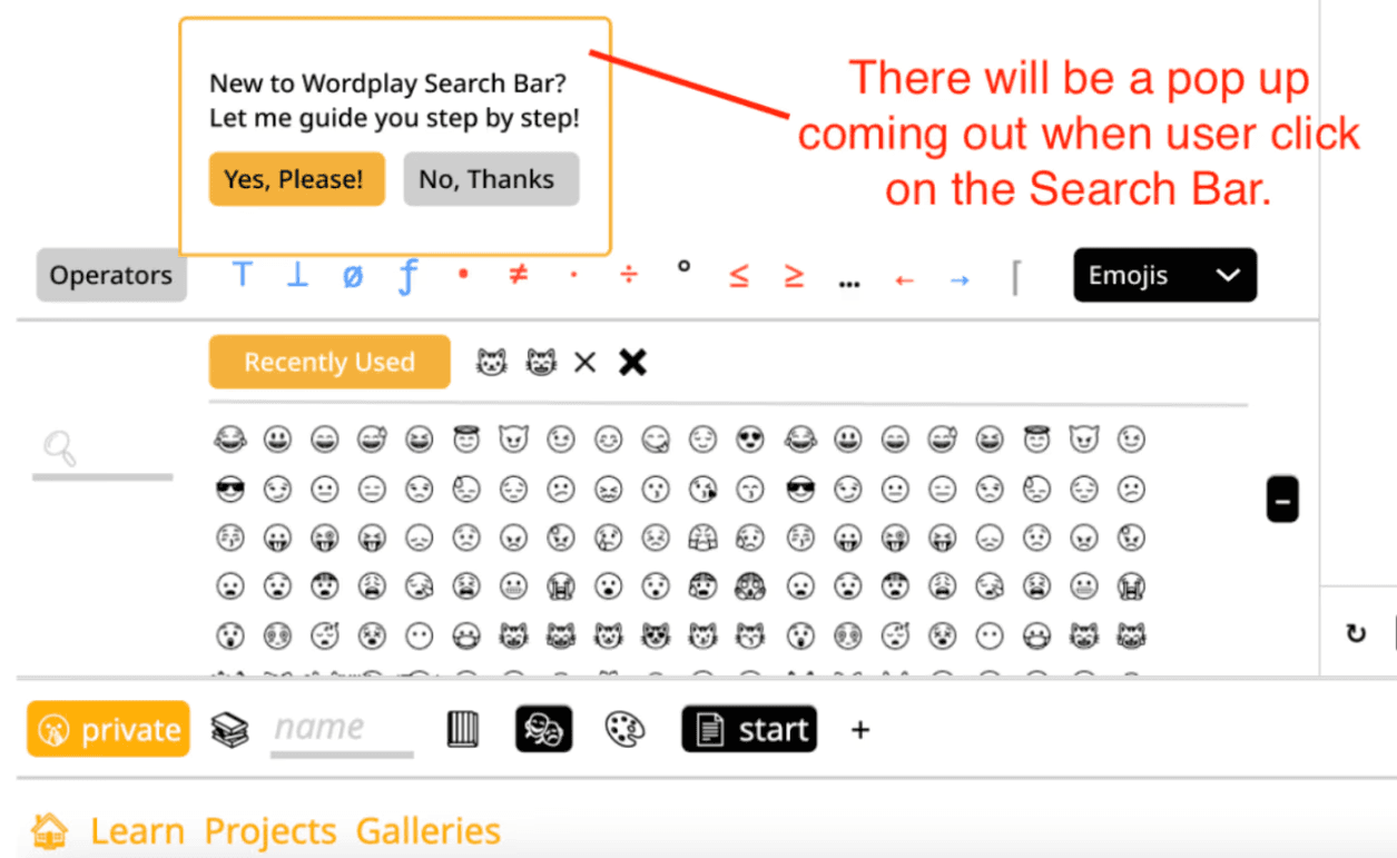
Adaptive Localization
As the localization library grows, the Unicode browser can adapt to each user’s selected language, highlighting language-specific character categories (e.g., Hanzi for Mandarin) while continuing to expand translated Unicode coverage. This creates a more scalable and inclusive experience for multilingual learners.
Adaptive Localization
As the localization library grows, the Unicode browser can adapt to each user’s selected language, highlighting language-specific character categories (e.g., Hanzi for Mandarin) while continuing to expand translated Unicode coverage. This creates a more scalable and inclusive experience for multilingual learners.
Adaptive Localization
As the localization library grows, the Unicode browser can adapt to each user’s selected language, highlighting language-specific character categories (e.g., Hanzi for Mandarin) while continuing to expand translated Unicode coverage. This creates a more scalable and inclusive experience for multilingual learners.
Impact & Reflection
This project reshaped how I think about educational technology.
I realized that learning doesn’t begin when users start coding—it begins the moment they interact with the product. Every confusing interaction adds cognitive load that competes with learning itself.
Designing Wordplay taught me that accessibility isn’t just about accommodating different users—it’s about creating experiences that help everyone learn with confidence.
It also reinforced the importance of understanding technical systems, allowing me to collaborate more effectively with engineers and design solutions that balanced usability, feasibility, and long-term scalability.
This project reshaped how I think about educational technology.
I realized that learning doesn’t begin when users start coding—it begins the moment they interact with the product. Every confusing interaction adds cognitive load that competes with learning itself.
Designing Wordplay taught me that accessibility isn’t just about accommodating different users—it’s about creating experiences that help everyone learn with confidence.
It also reinforced the importance of understanding technical systems, allowing me to collaborate more effectively with engineers and design solutions that balanced usability, feasibility, and long-term scalability.