Artisk
AI-Powered Design Platform for Everyone
PROJECT TYPE
B2C Web App
DURATION
7 Months
ROLE
Product Designer
TEAM
1 Project Manager
3 Product Designer
2 Software Engineer
PROJECT TYPE
B2C Web App
DURATION
7 Months
TEAM
1 Project Manager
3 Product Designers
2 Software Engineers
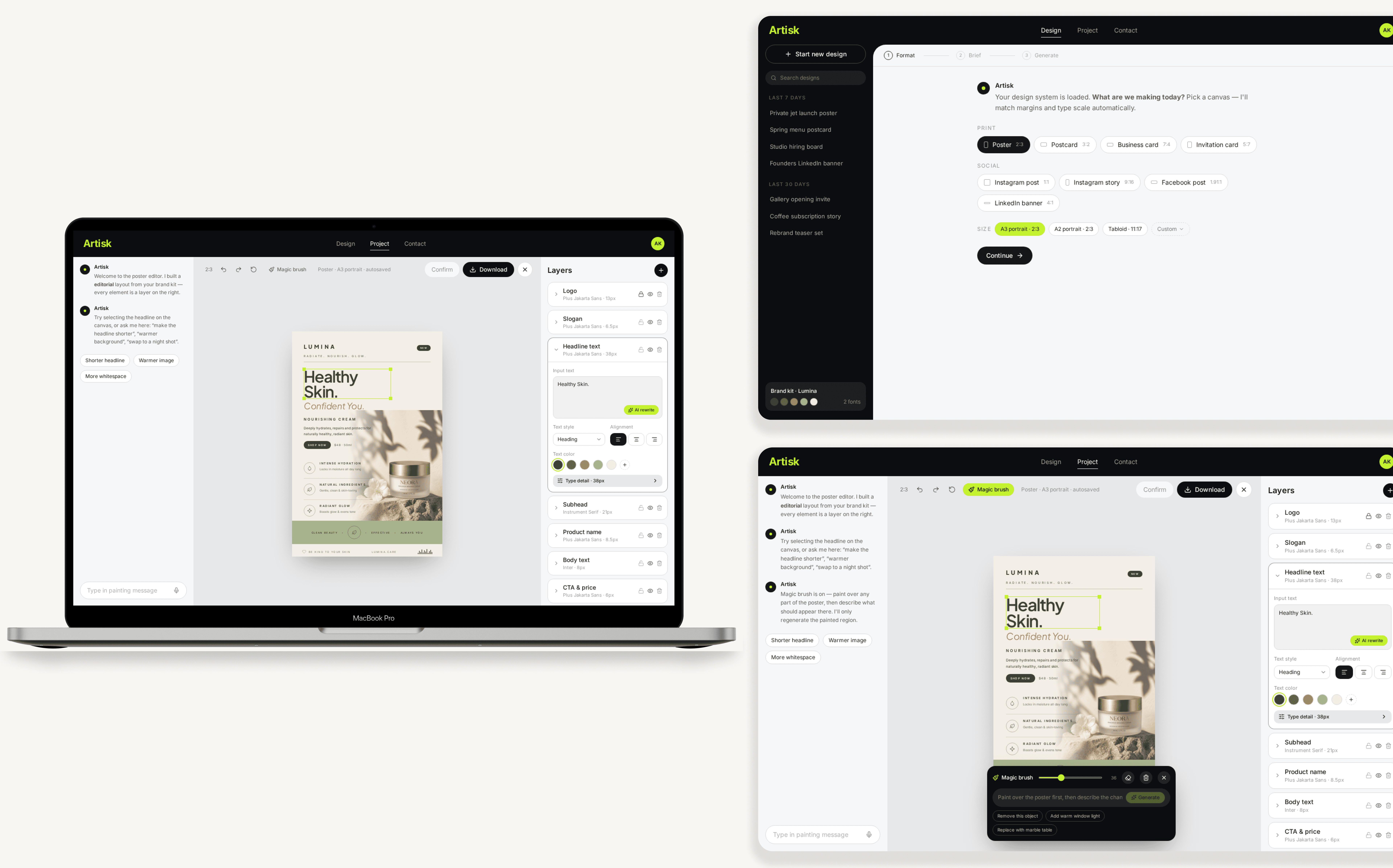
Artisk is an AI design platform that makes creating visuals really simple, even for people without a design background. It lets users quickly turn ideas into professional logos or posters and build a visual identity based on that, so anyone can create with confidence.
Design Outcome
❓Problem
Design for users with no design background
Existing design tools are too complex and time-consuming
Limited time & budget
❓Problem
Design for users with no design background
Existing design tools are too complex and time-consuming
Limited time & budget
👑 Goal
Increase platform retention and attractiveness
Integrate with the existing logo generator
Ensure the UI/UX is clean, consistent, and low-barrier for non-designers
👑 Goal
Increase platform retention and attractiveness
Integrate with the existing logo generator
Ensure the UI/UX is clean, consistent, and low-barrier for non-designers
Design Process
Who are we designed for?
We created user personas to better understand users’ goals, needs, and pain points, ensuring our design decisions addressed real user problems.
Who are we designed for?
We created user personas to better understand users’ goals, needs, and pain points, ensuring our design decisions addressed real user problems.
Competitive Analysis
As an early-stage startup with limited access to user interviews, we used competitive analysis to identify common user needs, usability barriers, and market opportunities.
Competitive Analysis
As an early-stage startup with limited access to user interviews, we used competitive analysis to identify common user needs, usability barriers, and market opportunities.
Adobe Photoshop, Illustrator
Industry benchmark; pushing AI features like Generative Fill
Steep learning curve, high cost, installation barriers for non-designers
Easy, intuitive, template-rich; great for small business owners
Simplified pro features, weak branding consistency, AI features hard to discover
Kittl, Flair.ai, Sivi, Pencil
Fast generation of branding assets and ad creatives
Ad-performance focused, narrow scope, inconsistent output quality
What we learned from this research is that there’s still a gap for a tool that combines the usability of Canva, the power of AI, and the design consistency of a system like Adobe — but in a way that’s simple, affordable, and accessible to non-designers. That’s where Artisk positions itself.
Internal Discussion - User Flow & Potential Features
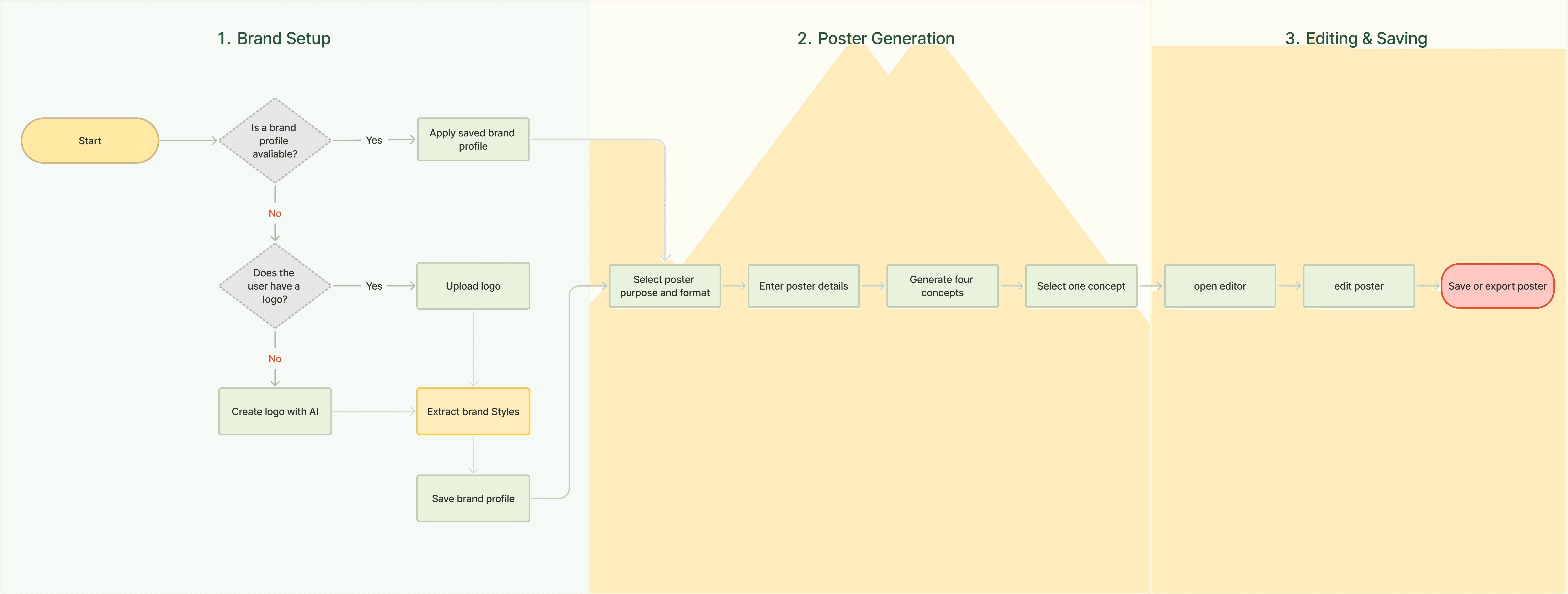
After completing the market research, I took the initiative to lead an internal workshop with product and engineering to align on the user flow and prioritize key features.
Together, we decided to create a connected experience: users could either upload an existing logo or generate one with AI, then reuse that visual identity across future projects. For the poster generator, we streamlined the flow so users select a purpose and format, answer a few guided questions, review four AI-generated options, and then customize and save their preferred design.
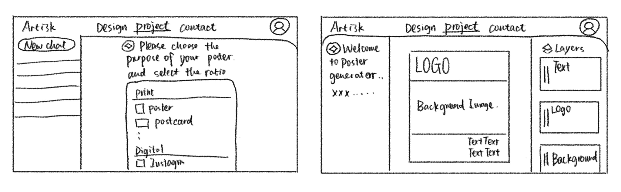
After defining the user flow in our workshop, I translated the ideas into low-fidelity wireframes. This allowed us to validate the end-to-end creation experience, gather feedback from product and engineering, and iterate on navigation and feature placement before investing in visual design. Once the flow was validated, I moved into high-fidelity designs to refine the interface and interactions.
The initial concept was only the starting point—the final experience was shaped through multiple iterations, each addressing key usability and product challenges.
Layer panel UI redesign
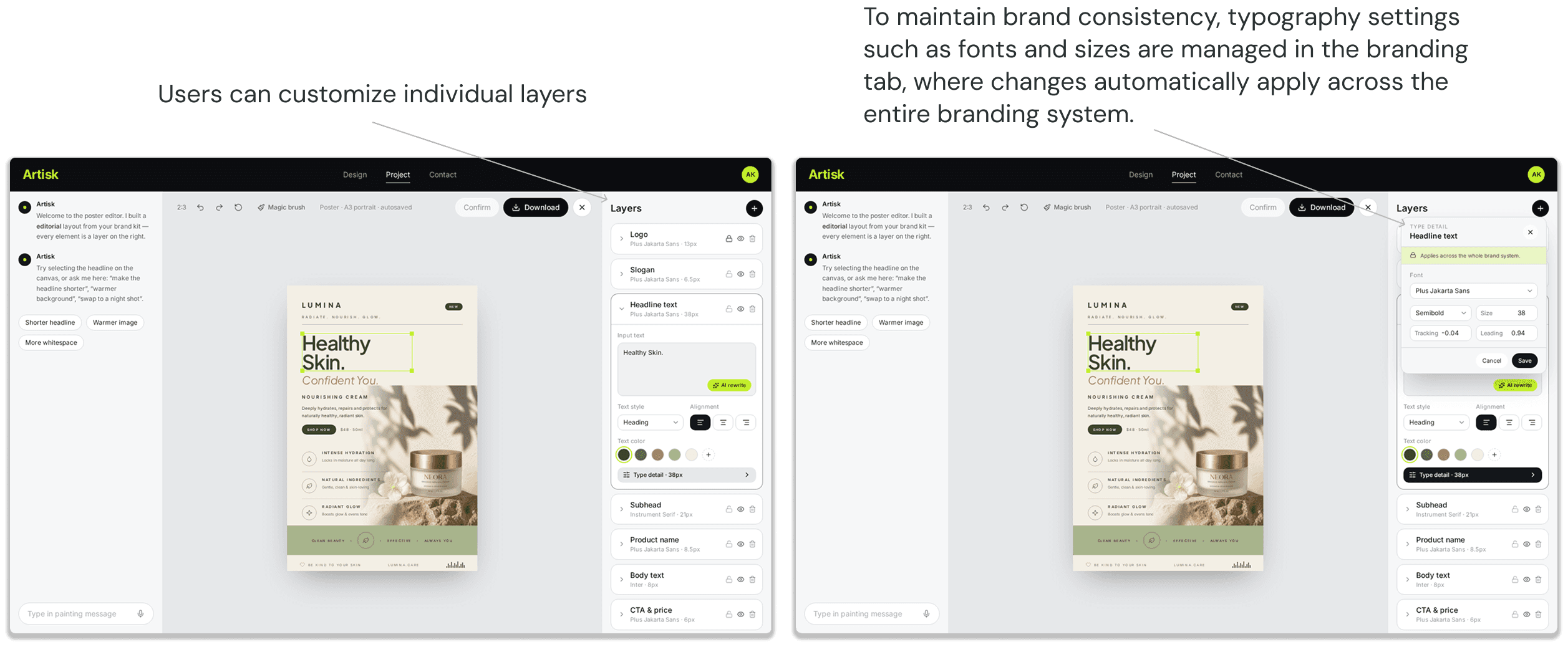
Initially, the panel was large and non-intuitive, as it didn't resemble an editable interface. Following feedback from multiple users during testing, I redesigned the panel to be thinner and more streamlined and user are able to turn on this panel to edit the details.
Layer panel UI redesign
Initially, the panel was large and non-intuitive, as it didn't resemble an editable interface. Following feedback from multiple users during testing, I redesigned the panel to be thinner and more streamlined and user are able to turn on this panel to edit the details.
Layer panel UI redesign
Initially, the panel was large and non-intuitive, as it didn't resemble an editable interface. Following feedback from multiple users during testing, I redesigned the panel to be thinner and more streamlined and user are able to turn on this panel to edit the details.
2. Enhancing the User Experience for Adding New Layers and Poster Elements
After improving the visual clarity of the layer panel, I started to think more deeply about how users interact when adding new layers. My initial idea was to place the “Add Layer” function in the top navigation bar, but that solution turned out to be limited: it wasn’t discoverable enough for beginners and didn’t scale well for future features.
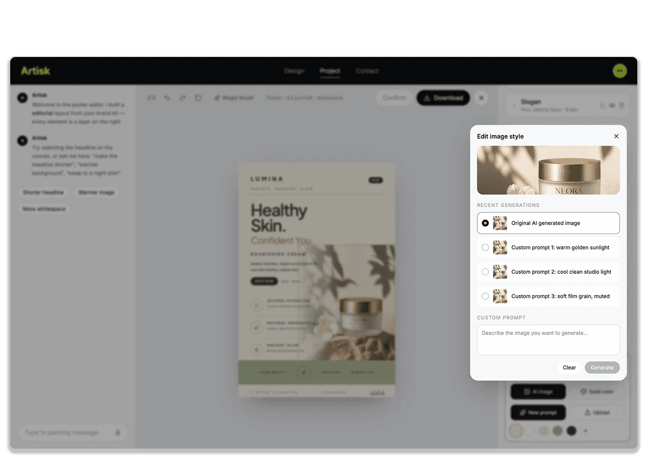
Through iteration, I explored a more holistic approach. First, I considered different user scenarios: beginners need a prominent “+ Add Layer” entry point, while advanced users benefit from shortcuts and contextual menus. Second, I thought about edge cases, such as how to prevent clutter when many layers are added, and providing undo/confirmation flows for accidental clicks. Third, I designed with scalability in mind: instead of a single “add” action, the new toolbar layout can expand to include text, image, and AI-generated components in the future.
2. Enhancing the User Experience for Adding New Layers and Poster Elements
After improving the visual clarity of the layer panel, I started to think more deeply about how users interact when adding new layers. My initial idea was to place the “Add Layer” function in the top navigation bar, but that solution turned out to be limited: it wasn’t discoverable enough for beginners and didn’t scale well for future features.
Through iteration, I explored a more holistic approach. First, I considered different user scenarios: beginners need a prominent “+ Add Layer” entry point, while advanced users benefit from shortcuts and contextual menus. Second, I thought about edge cases, such as how to prevent clutter when many layers are added, and providing undo/confirmation flows for accidental clicks. Third, I designed with scalability in mind: instead of a single “add” action, the new toolbar layout can expand to include text, image, and AI-generated components in the future.
2. Enhancing the User Experience for Adding New Layers and Poster Elements
After improving the visual clarity of the layer panel, I started to think more deeply about how users interact when adding new layers. My initial idea was to place the “Add Layer” function in the top navigation bar, but that solution turned out to be limited: it wasn’t discoverable enough for beginners and didn’t scale well for future features.
Through iteration, I explored a more holistic approach. First, I considered different user scenarios: beginners need a prominent “+ Add Layer” entry point, while advanced users benefit from shortcuts and contextual menus. Second, I thought about edge cases, such as how to prevent clutter when many layers are added, and providing undo/confirmation flows for accidental clicks. Third, I designed with scalability in mind: instead of a single “add” action, the new toolbar layout can expand to include text, image, and AI-generated components in the future.
Impact & Reflection
The impact was measurable: the redesigned poster experience increased feature adoption by 5% and task completion by 7%. By connecting logo and poster creation within one platform, users could carry their visual identity across projects without switching tools.
For me personally, I learned a lot about designing under business constraints — for example, balancing user needs with time, budget, and technical feasibility. I also improved my collaboration with developers, and got better at prioritizing features: knowing which UI elements to optimize now, and which ones to defer.
At the same time, there were limitations. For example, we didn’t run large-scale usability testing yet. And customization is still somewhat limited I believe those are things that could be improved in later iterations. Also, in a real product release, performance and loading speed would be critical areas to improve.
Compared to my academic project, which was more idealized, Artisk felt much closer to a real business product. It gave me experience bridging theory and practice, and taught me how to balance usability, business goals, and technical feasibility in a real-world setting.